Introduction
By viewing the Courses Dashboard in your platform, you can view various statistics and graphs comparing the statuses of learners enrolled in your platform courses.
To view the dashboard, access your platform as the Superadmin (or Power User with granted permissions). Then, reach the Admin Menu from the gear icon in the top right corner. In the E-Learning section of the menu, select the New Reports subitem. On the main reports page, find the Courses Dashboard section, then press the View button.
There are two common ways to navigate this dashboard. You can view a summary of all of the statistics and graphs for several courses at one time. This will be more of a general summary and comparison view. Alternatively, you can view stats and graphs related to a specific course.
You can download this dashboard as a PDF by pressing the corresponding button in the top right corner of the page. Additionally, you can export the data of the dashboard in XLS format. Press the arrow icon in the top right corner of the page. A download will automatically begin.
Viewing All Courses in the Dashboard
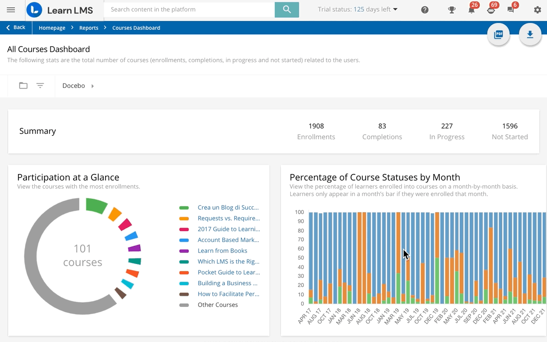
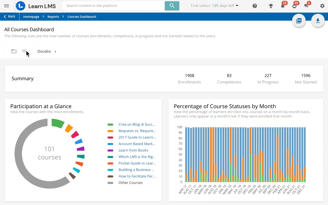
By default, the dashboard shows stats related to all courses in your platform with at least one person enrolled. If you’re viewing the report as a Power User, you will see only courses to which you have visibility. At the top of the dashboard, when the root branch is selected, you can see a summary of various numbers, including:
- Enrollments. This is the total number of enrollments of all of the users in the root branch and sub-branches into any course on the platform. Enrollments are counted on a user-to-course basis, so a user that is enrolled in five courses will be counted five times.*
- Completed, In Progress, or Not Started. This is the total number, of course, enrollment in which users have the Completed, In Progress, or Not Started status. Enrollment statuses are counted on a user-to-course basis, so a user that has a status of In Progress in three courses will be counted three times for that number.
*The total enrollment number also includes users that are enrolled on courses that may be on the Waiting List of a course or have any status in the course (i.e. Suspended) that somehow links the user to the course.
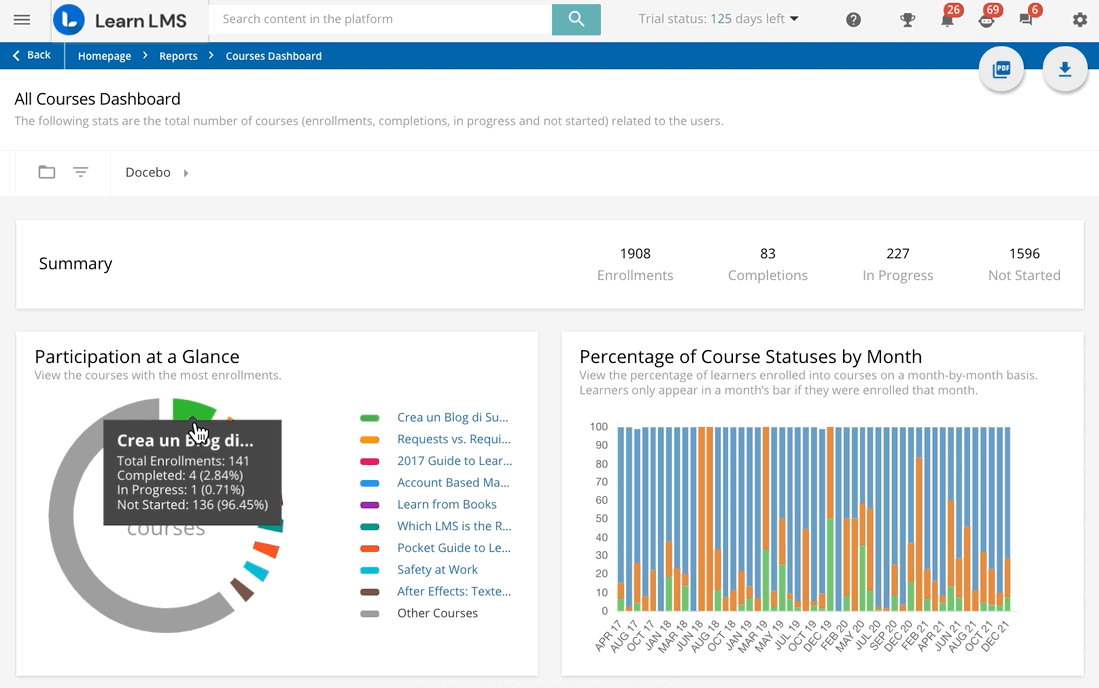
In the Participation at a Glance section, the doughnut chart displays the courses with the highest number of enrollments. For each course, the size of their portion in the chart depends on the total number of users enrolled, regardless of the course status of the enrolled users.
You can hover your mouse over a course’s portion of the graph to view the enrollment statistics related to that branch. By clicking on the course’s name in the chart, the dashboard will then display graphs and statistics related specifically to that course (see the section below).
In the Percentage, of Course, Statuses by Month section, you can view the percentage of learners enrolled in courses on a month-by-month basis. Learners appear in a month’s bar if they were enrolled in a course that month. So, if John Doe was enrolled in a course in October 2021 but was still enrolled in the course in December 2021, he will only appear in October’s bar in the chart.
By hovering your mouse over the month’s bar, you can view the total number of users enrolled that month divided by their current status in the course.
In the Courses section below, you can see each course in the platform with at least one person enrolled. In each course’s row, you can view the course’s name and code, the type of course (E-Learning or ILT (Instructor-Led Training), if the course requires an E-Signature, and the total number of users enrolled in the course (specifying the total number of users with the Completed, In Progress, or Not Started status in the course). Click on the course’s name to be redirected to that course’s dashboard view (see the section below).
Viewing One Course in the Dashboard
To view one course in the dashboard, you can click on the course’s name or item in any of the widgets that appear in the dashboard, which will automatically reload to show you information related to that specific course.
In the Course Progression section, the doughnut chart displays the percentage of users in the course that have a specific status: Not Started, In Progress, or Completed. The percentage is calculated by the number of currently enrolled users with that status divided by the total number of users currently enrolled in the course.
In the Percentage, of Course, Statuses by Month section, you can view the percentage of learners enrolled in the selected course on a month-by-month basis. Learners appear in a month’s bar if they were enrolled in a course that month. So, if John Doe was enrolled in the course in October 2021 but was still enrolled in the course in December 2021, he will only appear in October’s bar in the chart.
By hovering your mouse over the month’s bar, you can view the total number of users enrolled that month divided by their current status in the course.
In the Users section below, you can view a list of the users currently enrolled in the course, with each user’s row displaying the username, first and last name, current course status, enrollment, and completion date, the total amount of time in the course, the time and date of the user’s last course access, and the score (if applicable).
Viewing the Dashboard by Branch
By default, the dashboard shows stats related to the root branch and the branches directly linked to the root branch. If you’re viewing the report as a Power User, you will see only branches to which you have visibility. At the top of the dashboard, when the root branch is selected, you can see a summary of various numbers related to all of the users in that branch and the sub-branches of the root branch.
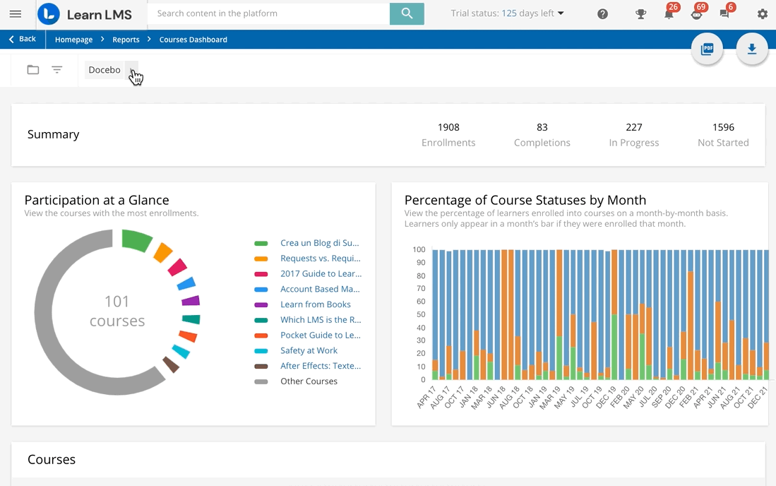
If you want to view the information in this dashboard for only a specific branch in your platform, press the folder icon in the top left corner of the page, then select a branch or sub-branch from the slideout panel that appears below. The dashboard will automatically refresh to show data related to that branch.
Using Filters in the Dashboard
If you want to apply filters to the data displayed in the dashboard, press the filters icon in the top left corner of the page. In the slideout menu that appears below, you can flag a time frame to apply, or flag the Custom option in the Time Frame section to a select specific date range.
You can also flag the Hide Deactivate Users option in the Deactivated Users section to remove any users currently deactivated in the platform from the data calculations, so the data appearing in the dashboard will only be applied to currently activated users. Once you’ve selected your filters, press Apply Filter. The dashboard will automatically refresh to show the updated data with the filters applied.
Was this article helpful?
That’s Great!
Thank you for your feedback
Sorry! We couldn't be helpful
Thank you for your feedback
Feedback sent
We appreciate your effort and will try to fix the article